Akseom Brand Identity
Akseom is a new marketing agency based in Toronto, Canada. The client wanted the brand to have modern, innovative look.
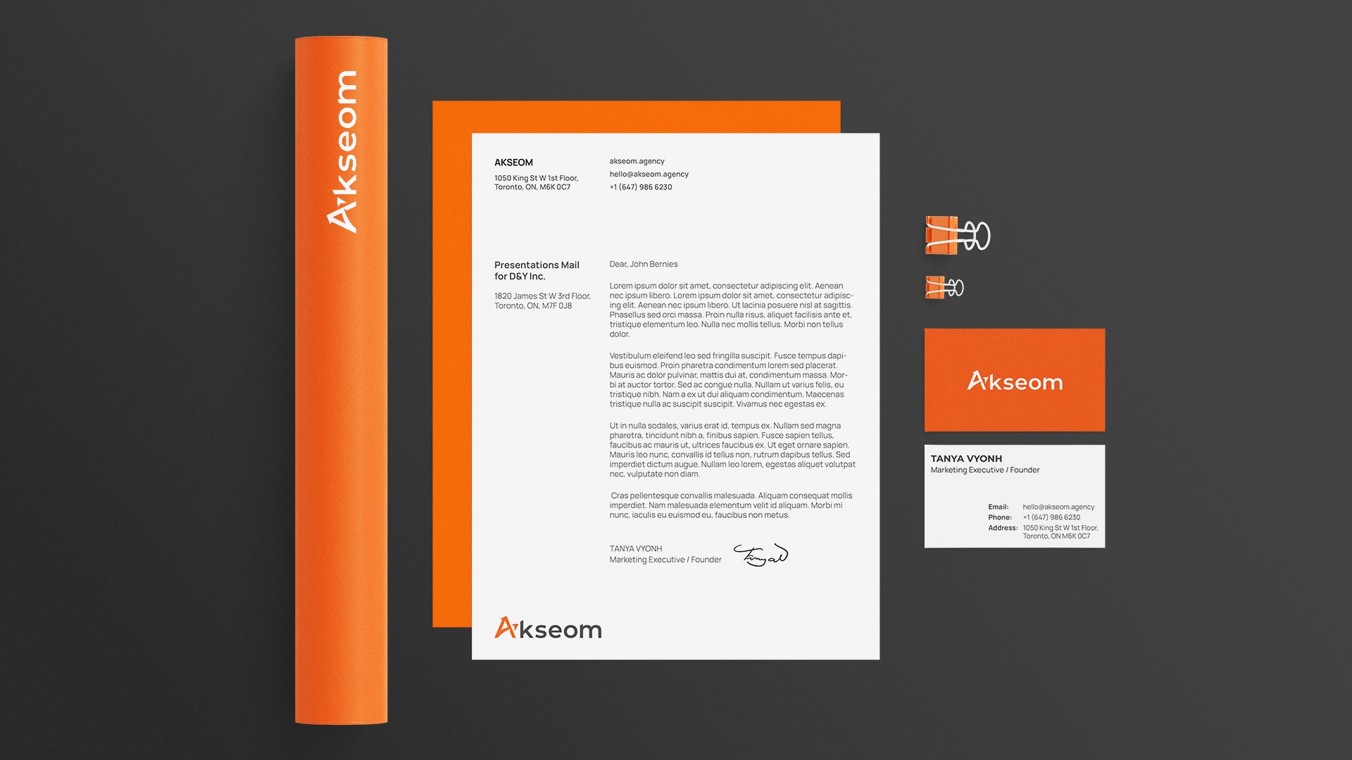
I came up with a concept that has a very minimalistic, and bright tone of voice. The wordmark is based on the sans serif font. We can see that the orange and charcoal grey colours create a nice contrast. The letter “A” is what makes the logo unique, since it has the arrow symbol inserted in it. This symbol is traditional in marketing industry, which means the development and growth.
To sum up all the above mentioned, the initial goal to achieve modern and fresh look was successfully accomplished.